Project Overview
Timeline: 2020 – 2021
Role: UI/UX designer (Team Project), User Research, Wireframing, Prototyping, UI design
Tools: Pen & paper, Figma, Adobe photoshop
Prototype: Gadget protect prototype links
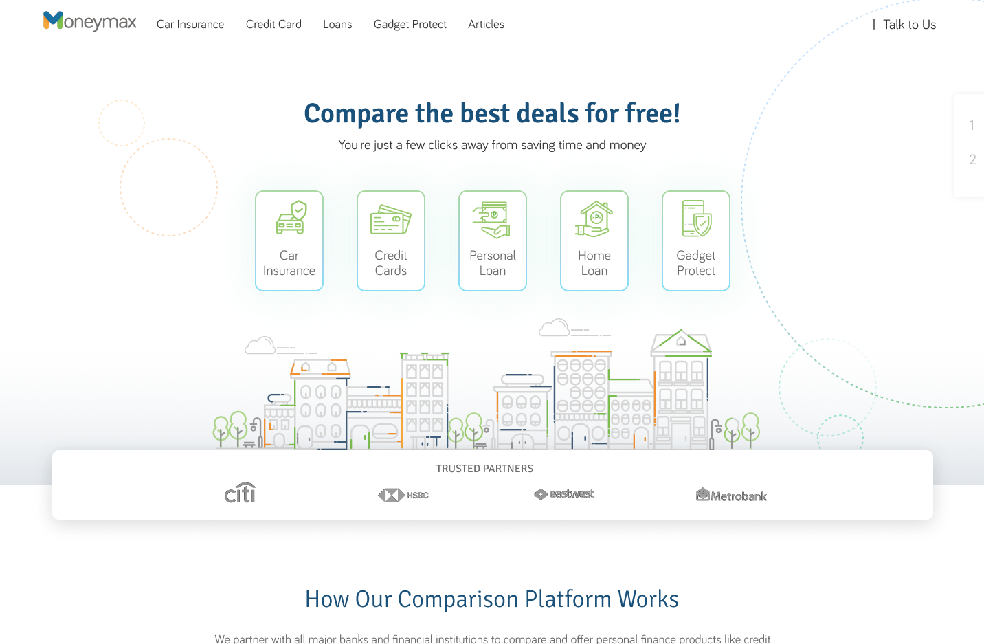
Before

Moneymax Homepage redesign
The Task
Create a unique design that boosts signups for Moneymax, On both viewports (Desktop and Mobile website).
Product Feature:
- The product’s CTA should be getting much attention from the user and I should have a strong visual presentation of each product we offer.
- Users must have adequate information from the website explaining what the website does and the feature offers.
- I should have clean look and feel to entice our target user.
- It must be informative that the user can understand easily without losing their interest in the website.
Competitive Analysis Summary
Compared to its competitors, the Moneymax homepage has an obsolete website design and a weak content structure. However, it offers the best price deals on the market for comparison website insurance. By highlighting those advantages and using a strong, modern website design Moneymax can easily become seen as the hands-down best option for its target audience (young millennials) as well as other groups of users.
User Personas Summary
- Emphasize that Moneymax always stays up to date with its product offer in the market. With the new design approach, it can continue to introduce new features as well
- Offer the service of website review to help the company create more effective layouts (this is especially relevant for people who run their own business and get leads through the website). This service will also be another source of income for Moneymax
Since one of the Moneymax target audiences is the young Millenials, I conducted some research on the best practices in digital design that suit the taste young generation. The key takeaways are as follows:
- Use clear navigation structure, larger UI design elements, a lot of whitespaces, and choose distinctive colors
- Focus on real-life applications to get the audience interested in your product, with less emphasis on technology. Moneymax’s main landing page must clearly showcase what people can do with their technology and use testimonials that are as personable as possible
- Use a minimum of 14pt for font size. Use boldface to emphasize content, and avoid using italic. Avoid long blocks of text by breaking copy into chunks wherever possible.
Design Prototyping
Based on research I had a clear idea about the product. To make this process more productive, I made a low-fi wireframe layout. I use Figma here to create a wireframe to make a simple and fast way to understand the flow also help the clients get a clear understanding of the layout structure.

Final Say
When working on the Moneymax homepage redesign I came up with a nice simple and modern design at first. It synergized perfectly with the client’s branding, but I kept asking myself “Will this really make an impact on client’s business, or am I doing this just because I like it?”. Because of those doubts, I tried another approach and came up with a new style that will be even more effective. It still complements Moneymax branding while giving the website a highly desired, modern look.

