Project Overview
Timeline: 2020 – 2021
Role: UI/UX designer (Team Project), User Research, Wireframing, Prototyping, UI design
Tools: Pen & paper, Figma, Adobe photoshop
Prototype: Desktop Prototype Mobile Prototype
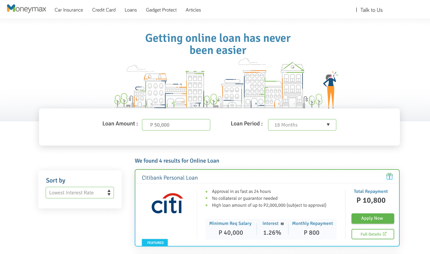
Before

Moneymax Resulate Page Redesign
We redesign the page to become more approachable for the young professional and give more traffic to our website by optimizing the elements, re-arrange it to be more readable. The basis of the new design was from the customer feedback that the sales team gathered and stakeholder suggestions.
The Task
Create a UI for both views (Mobile and Desktop) with this specification
We redesigned the page to:
- become more approachable for young professionals
- improve the conversion rate on the results pages
- enhance the user experience by optimizing and rearranging the elements to make them more readable
- standardize look, feel, and user journey across verticals
The Process
The basis of the new design was from the customer feedback that the sales team gathered, stakeholder suggestions & functional limitations around displaying additional information.
The major task was to redesign the current product page representing the four basic features said above. In addition, I decided to create a design that makes it more appealing to the target user like the young millennials that suit their taste.
Weekly Catch-up
We did a weekly catch-up to redefine our ideas based on the prototype presented. We carefully reviewed all the designs and discussed all the possible ways to make it more user-friendly. We used voice recording during the catch-up for documentation purposes. It took us 4 Iterations before we finalized the design.
UX Design
Based on research I had a clear idea about the product. To make this process more productive, I made a low-fi wireframe layout. I use Figma here to create a wireframe to make a simple and fast way to understand the flow also help the clients get a clear understanding of the layout structure.
Sketching
We did a low-fidelity design to consolidate our ideas and make a visual presentation of it before we proceed with the prototype.
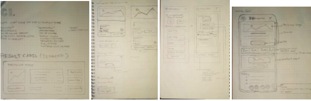
I use Figma here to create a wireframe to make a simple and fast way to understand the flow also help the clients get a clear understanding of the layout structure.
User testing
We did conduct User testing and invite 14 – 16 users (half for car insurance, half for banking) to test the prototype offline (present at our office) and we happy to say that we’ve got positive feedback from the person participating in the event.
A/B testing
Once the user testing is complete, we can proceed with implementing the final version and run that against the existing design. We will also use Hotjar heatmaps and recordings to understand how users interact with the new designs.
Final Say
We are hoping to see that all the verticals increasing the revenue by at least 3% and decreasing the dropoff rate because of the modification we did. We having a plan to launch this by the second quarter of this year.

